
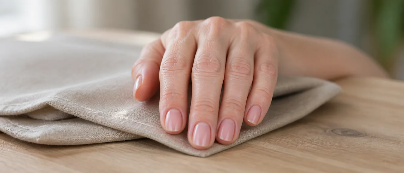
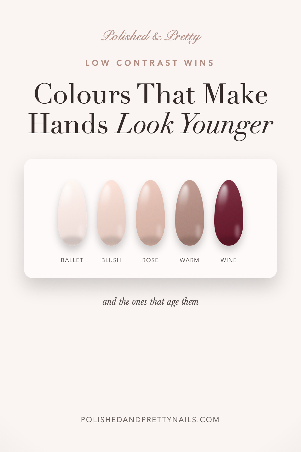
The nail colors that make hands look younger are the ones that draw attention away from the skin and toward the nail itself. Soft pinks, warm nudes, sheer neutrals, and clear glossy finishes all do this. The shades that age hands are the high-contrast ones that make the skin around them look darker or more textured by comparison.
Here is what to wear, what to avoid, and why length and shape matter as much as color. My elegant nail designs for women over 40 post covers the designs alongside this.
Why contrast is the whole issue
Everything here follows from one principle, and it is worth understanding rather than memorizing a shade list.
The eye judges skin by comparison with whatever is next to it. A very light or very bright polish sitting against the hand makes the surrounding skin look darker, more uneven, and more textured, because the polish sets a new reference point for brightness.
Hands change with age in ways that show as unevenness: sun spots, visible veins, thinner skin, more defined knuckles. Anything that increases contrast makes all of that more visible. Anything that reduces it does the opposite.
This is why the answer is not simply pale shades. A stark white is pale and it is one of the least flattering things you can wear on mature hands.
Soft pinks
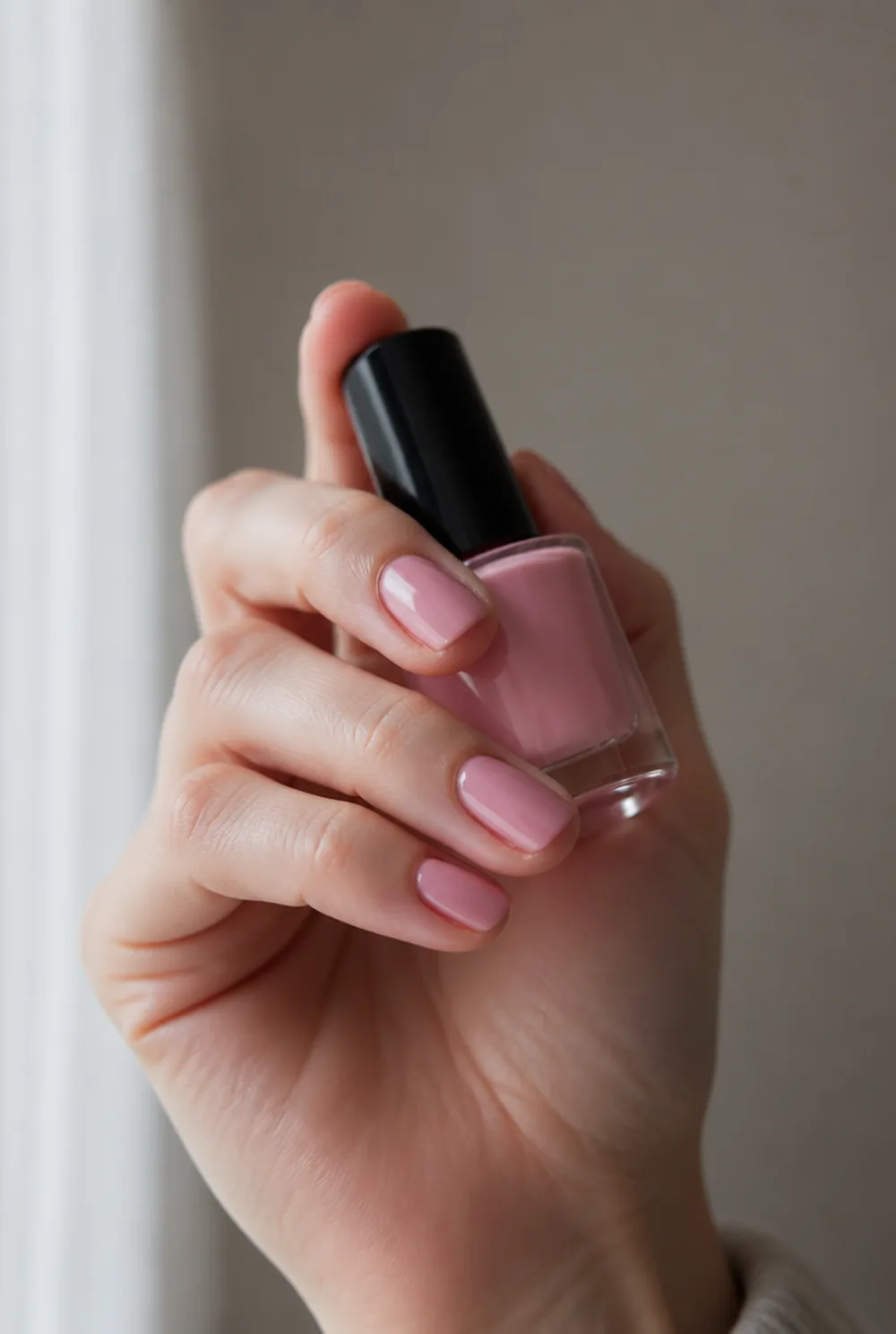
This is the most reliable category and it is where we would start.
A soft ballet pink, a warm rose, or a dusty blush sits close enough to natural skin that there is no hard boundary anywhere. The nail looks healthy and groomed and the hand does not get compared against anything.
Warm pinks work better than cool ones here. Cool baby pinks have a blue base that can make skin look slightly gray, particularly under indoor lighting.
Sheer versions are even better than opaque ones, since they let some of the natural nail through and blur the edges further. My pink nail designs post covers the range.
Warm nudes
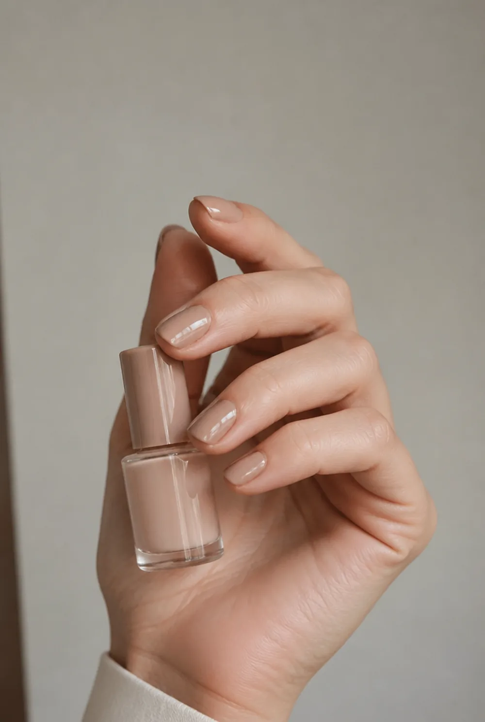
A nude matched to your own skin is the most flattering thing available at any age, and it does the most for mature hands.
Matched means it belongs to the hand rather than sitting on it. Test the bottle against the back of your hand in daylight, not against your palm or under shop lighting.
Warm beiges, soft caramels, and peachy nudes all work. Avoid anything with a gray or ashy base, which can pull the skin down with it.
A matched nude also visually lengthens the nail by blurring where the fingertip ends, which is worth having. My nude nail designs post covers matching.
Clear and glossy
The most underrated option, and the one that costs the least.
Buffed nails under a high-gloss clear top coat look immaculate and add zero contrast at all. Shine reads as health, and a glossy finish catches light in a way that makes the whole hand look better cared for.
This is also the lowest-maintenance choice by a distance, since there is no color to chip and no grow-out line to manage.
Pair it with tidy cuticles and it looks more expensive than most manicures. My cuticle pushing guide covers that half of it.
Deep shades that do work
Low contrast does not mean no color, and this is where people get bad advice.
Deep, muted shades work well because they read as rich rather than bright. Burgundy, oxblood, plum, deep berry, and dark chocolate all look sophisticated on mature hands and none of them create the harsh brightness contrast that ages skin.
The key is keeping them short. A deep shade on short nails is elegant; the same shade on long nails becomes a statement that draws the eye to the hand.
My burgundy nails post covers the most flattering of these.
What ages hands
Four things consistently work against mature hands.
Stark white is the worst. It sets the brightest possible reference point, so every bit of unevenness in the surrounding skin becomes more visible. A creamy off-white or milky shade is fine; a bright optical white is not.
Frosted and pearlescent finishes are the second, and they are dated as well as unflattering. Frost sits in ridges and emphasizes the vertical lines that develop in nails with age, which is exactly what you do not want highlighted.
Very bright corals and orange-based shades are the third. They pull yellow out of skin. And fourth, anything ashy or gray-based, which can make the hand look tired.
Why matte is a problem
Matte deserves its own mention because it has been so popular.
Matte finishes absorb light rather than reflecting it, which flattens the nail and removes the shine that reads as health. On mature hands it can look chalky and it draws attention to the texture of the nail surface rather than away from it.
Gloss is doing real work here, and it is the finish to default to. My matte nails post covers where the finish does suit.
The French tip question
A French is the manicure most associated with looking dated, and that reputation comes from one specific version of it rather than the idea itself.
The version that ages a hand is the 1990s one: a thick, chalky, opaque white tip with a hard smile line, usually on a longer square nail. The white is the brightest thing on the hand and the line cuts the nail in two, so it manages to hit two of the problems on this page at once.
The modern version is the opposite and it is genuinely one of the most flattering things you can wear. A hairline tip under 1.5mm, in a soft cream or a sheer off-white rather than a bright one, on a short oval nail. It defines the nail without creating contrast.
A chrome or nude-on-nude tip works even better, since there is barely any color difference at all. My chrome French nails post covers that version.
Length and shape matter as much
Color is only part of it, and shape is the part people neglect.
Short to medium length looks more current and more elegant than long nails on any hand, and particularly here. Very long nails draw the eye to the hand and invite comparison, which is the opposite of the goal.
Oval or soft almond are the most flattering shapes, since the taper lengthens the finger and the softness suits a hand with more defined knuckles. Square with sharp corners looks harsher and dates the manicure.
Our oval nails post covers the shape, and our French manicure for mature hands post covers the tip.
The skin does more than the polish
Worth saying plainly, because no color compensates for this.
Cuticle oil daily and hand cream after every wash will do more for how your hands look than any shade on this page. Dry, ragged cuticles make a manicure look neglected regardless of the color on top.
Sunscreen on the backs of the hands is the single most effective long-term measure, since sun damage is what causes most of the unevenness this whole article is about.
A tidy cuticle line and a glossy nail beats an expensive color on neglected hands every time.
FAQ
What nail color makes hands look younger?
Soft warm pinks, nudes matched to your own skin, and clear glossy finishes. All three keep contrast low, so the surrounding skin is not compared against a brighter reference point. Deep muted shades like burgundy and plum also work well on short nails.
What nail colors make hands look older?
Stark optical white, frosted and pearlescent finishes, bright orange-based corals, and anything ashy or gray-based. White creates maximum contrast so every bit of skin unevenness shows, and frost sits in the vertical ridges that develop in nails with age.
Should older hands avoid dark nail polish?
No, as long as it is deep and muted rather than bright, and kept on short nails. Burgundy, oxblood, plum, and dark chocolate all look sophisticated and do not create the brightness contrast that highlights skin texture.
Is matte or glossy better for mature hands?
Glossy. Shine reads as health and reflects light away from the nail surface, while matte absorbs light, flattens the nail, and draws attention to surface texture. A high-gloss top coat is one of the most flattering finishes available.
Cuticle oil and a glossy top coat will do more than any shade change. My elegant nail designs over 40 post covers what to wear.